
The Power of Graph Analysis in Unveiling Hidden Data Patterns
Unlock hidden insights in data using graph analysis: From Euler's puzzles to modern analytics.

Generally when we are facing a Data Analysis task the main target is to unveil interesting patterns in data. Numerous techniques exist for this purpose, such as group aggregations, trends over time, correlations… And although many of these can inform us or any other stakeholders on the behaviour of certain processes or entities in the data, a graph analysis approach can unveil patterns not immediately obvious on (perhaps) a tabular format.
What is a Graph?
To delve into the depth of graph analysis, we first need to understand its foundational concept: what exactly is a graph?
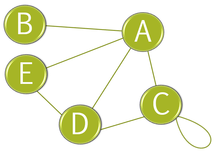
Simply put, think of a graph as a mathematical object composed by vertices (dots) and edges (lines), these edges connect two vertexes between each-other or even itself.
Here’s a visual example:
This structure came about from the famous Swiss mathematician Leonhard Euler in 1735 when trying to solve a puzzle called Seven Bridges of Königsberg, in which people from this region were amused by, they wondered if it was possible to cross all seven bridges in a continuous walk without recrossing any of them. He showed that it wasn’t.
Euler’s method was to replace each land mass by vertices and the bridges as the edges connecting them:
By doing this the problem reduces to traverse the graph from one sweep of a pencil without even raising it - another type of puzzle I’ve encountered before, if I recall correctly by challenge from a friend in pre-school which I most likely failed.
The explanation has to do with a concept known as degree, which assigns to each vertex a count on the lines that fall into it, in the case of the bridges puzzle the degrees for the vertexes are: 5, 3, 3, 3; and the problem can be solved if the graph (or any graph) have exactly zero or two nodes of odd degree, in this case the four vertexes have odd degree.
Why are Graphs useful when analyzing data?
Graphs become specially relevant when trying to understand processes and connections between entities. Depending on the industry they can be more relevant than others, for example, graphs are common in many day-to-day applications we encounter today, such as maps - when you’re trying to get from point A to F, - in telecommunications, computer science, social media networks... but in many other industries graphs are overlooked when doing data analysis.
The reason graphs to be overlooked can vary, perhaps you haven’t heard them before, and/or stakeholders aren’t familiar, and/or can be too abstract to explain for your domain, whatever the case, my intention is to convince you that they are useful to keep in mind when doing data analysis, perhaps you’ll find them in places you’ve never though possible. This last is not an overstatement, I will show you an example below.
How to use Graphs in data analysis?
I’ve encountered graphs structures unexpectedly when tying to analyze data that wasn’t in a graph structure initially. To better illustrate, let’s look at a practical example, the Kaggle competition KKD Cup 2014 aimed to predict exciting school projects for funding.
The dataset encompasses a lot of information about the projects, such as the subject area the project tackles (Literature, Math, History…), the type of request for gadgets or books, information about the school and donors, a description on the mission, the financial requirements, among others.
The relevant tables for our example are:
Donations: contains information about each donation to a project, for example, donor id, if the donor is a teacher or not, donation amount, donor location….
Outcomes: contains information about the outcomes of projects (exciting or not).
In case you’re wondering, not every project received funding, and the projects that are deemed “exciting”, are because they reached the amount requested.
One interesting information about the donations table is the ability to find the donors that contributed to certain projects, which immediately made me wonder if there’s an interesting pattern in the donors behaviour, are they sharing interesting projects with people they know or promoting it somehow? and to answer my question I had to stablish a graph.
In this case, a graph is defined with the vertexes as the donors, and the donors are linked (edges) if they contributed, at least once, to the same project. This results in a graph (G1) with 1.2M vertexes and 15.7M edges. Doing a visual analysis on this graph is quite challenging due the quantity of vertexes and edges to represent, but graph theory gives us useful tools to unveil information about G1.
Exists a metric called Degree Centrality. This metric assigns on every vertex the the number of edges that connect to it, in our context, the metric is normalized and it indicates that donors with the highest value of centrality are influential donors in the overall network:
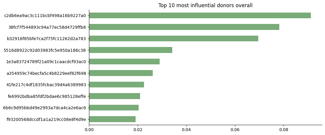
It is visually noticeable it exists a podium of influential donors that slowly fades into smaller values. We can extract more information from this initial graph structure and only looking at the graph with donors of exciting projects only:
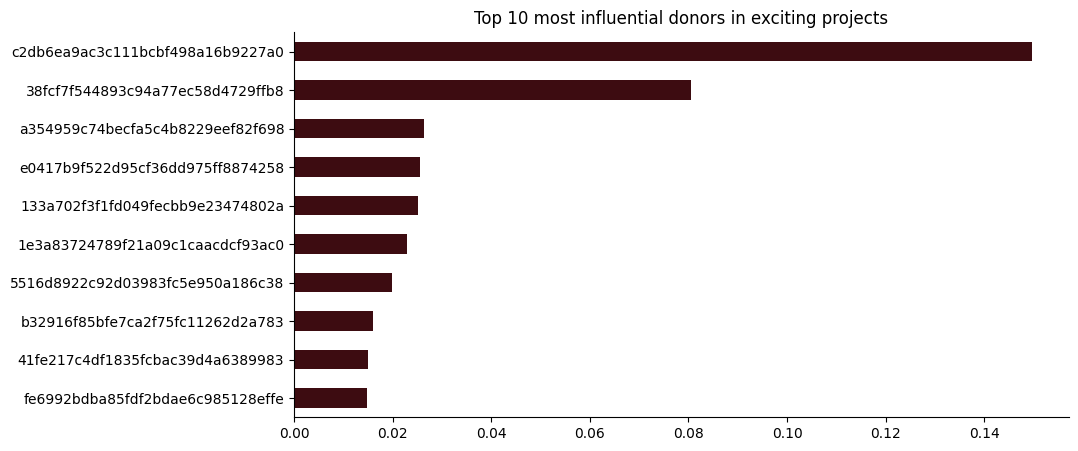
And we see higher jumps in influence between consecutive ranks (1st to 2nd, 2nd to 3rd…) with a top 2 of influential donors, and the rest having similar centrality or influence between each-other.
But by looking at the top 10 influential and donors on each level (exciting projects and all projects) we cannot have a good understanding on the complete network, is like looking at the top 10 richest people in each country and stablishing conclusions for the entire country from that, we might miss certain nuances from the countries.
To really understand the graph (network) we would need to analyze the centrality metrics for all the vertexes, considering the graph for all projects, and the graph for only exciting projects. We’ll add an extra to the analysis by also studying the centrality metrics only for the projects “not exciting”.
Obtaining the following distributions:
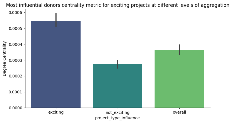
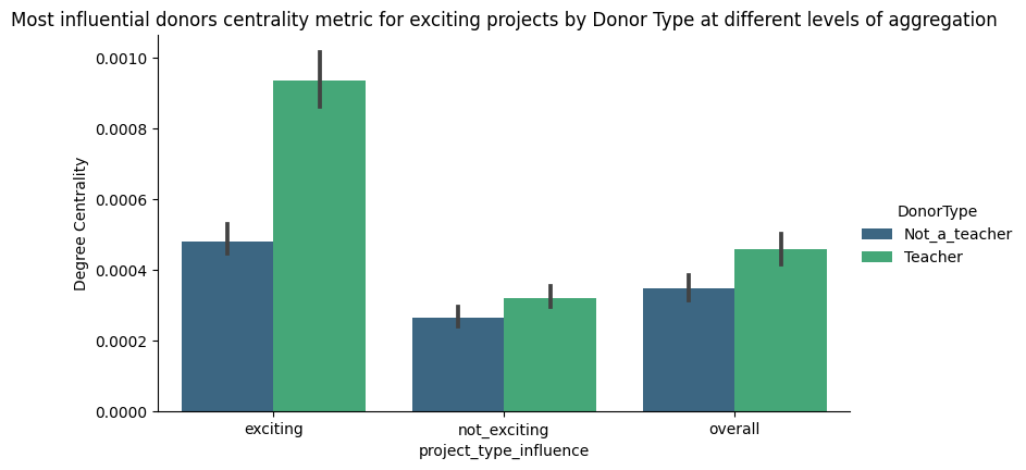
This plot indicates a couple of things:
Exciting projects, when compared to not exciting projects, have a higher centrality in average i.e. donors to exciting projects tend to make more noise and/or entice others to donate, working more as a team.
It is also noticeable, by the vertical bar, that we encounter a variety of degrees of influence on exciting projects when compared to their counterpart.
For the overall case, exciting projects exercise an improving effect on the centrality metric. Even more, by complementing information from a tabular analysis we can keep adding dimensions into the analysis and draw interesting knowledge, such is the case of donors that are also teachers, a fact reflected in the centrality metric as well:
Still not sure?
Perhaps you are still doubtful, specially if graphs are new to you.
Understanding how from a centrality metric statements such as: “donors to exciting projects tend to make more noise and/or entice others to donate, working more as a team”, isn’t exactly straightforward.
No worries, there’s an easier and visually appealing way to make it more obvious.
There are millions of vertexes and edges, instead of graphically represent them all let’s choose a random sampling of 1k, 4k and 10k from the graphs and represent to compare side by side (vertexes in blue, edges in black):
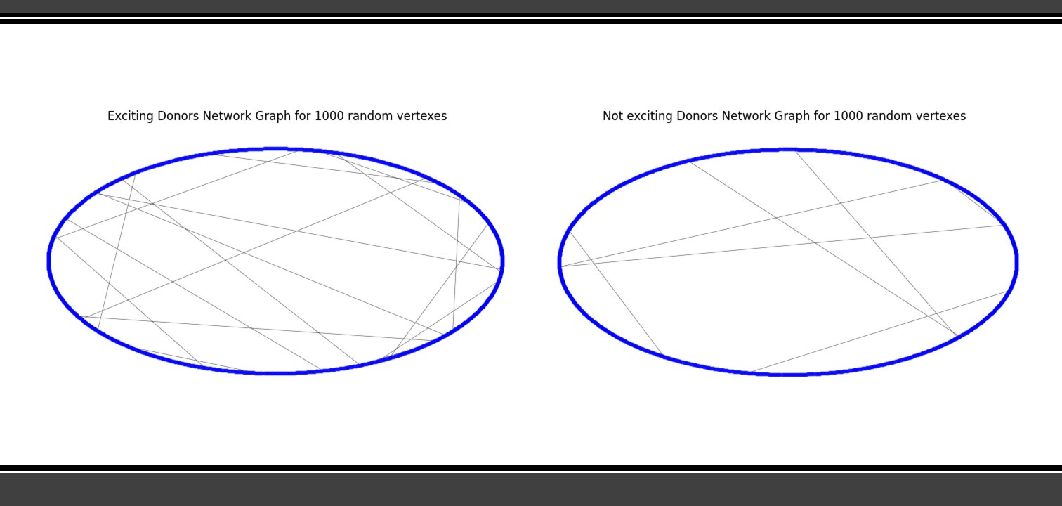
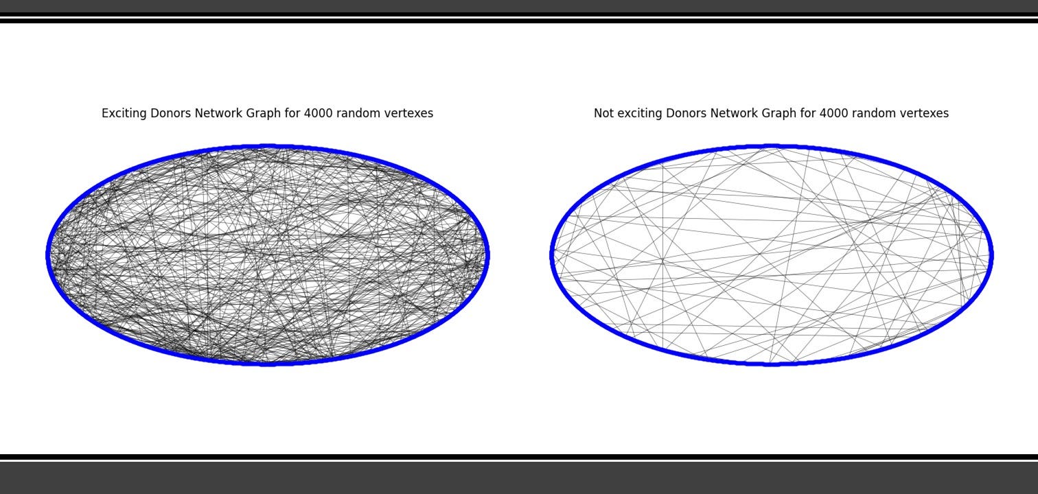
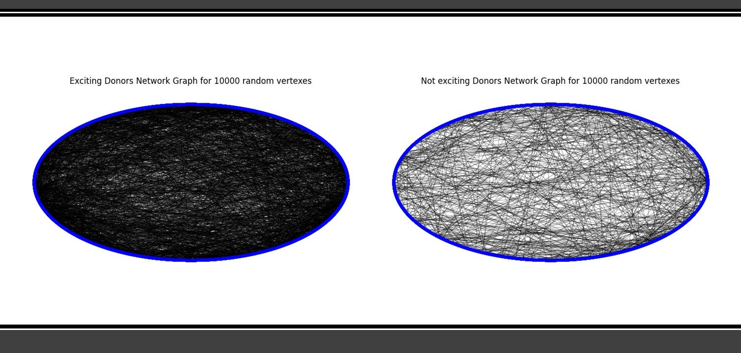
Is noticeable that with the same sampling size, donors for exciting projects are more connected than the same sampling of its counterpart.
Is this this actually important?
It is!
Euler’s invention to tackle a puzzle back in his time contributed to the development of several branches of mathematics, today many applications leverage graph structures for their modeling or functioning, and complex systems often require their capabilities. Using them for analysis will unveil synergies and processes previously hidden.
I must say, just for sake of openness, I am biased on the topic because I fell in love with graphs a long time ago. Back in uni, I had a great teacher in Abstract Algebra that was doing research on a topic called “Species of Structures” and sometimes he showed how the topics we were learning were surprisingly easy solved by this theory, in which an undirected graph is a particular case. We asked him to open an elective for us to learn more, which he later did.
In conclusion, keep graphs at hand for your Data Analysis tasks, it can be incredible what they can unveil, as my professor said to my class: “These structures are powerful and fun, is doing mathematics by drawing, and that can be counter intuitive for many, even to some hardcore mathematicians”.